

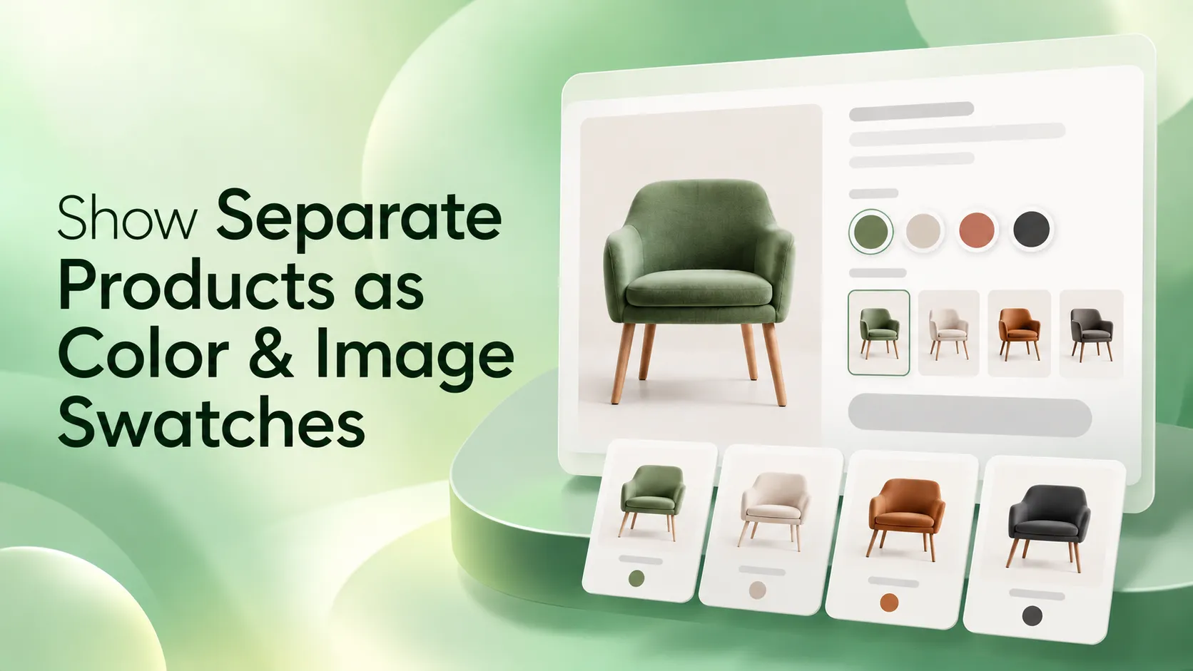
WowOptions uses Cross Product Links to turn supported option values into links to other Shopify product pages. This lets you use color swatches Shopify shoppers can recognize, or image swatches Shopify stores can use for patterns and styles, while each destination remains a separate product.
This matters because a swatch can do two different jobs. It can select an option on the current product, or it can send the shopper to another product page.
For separate products, you need the second behavior. WowOptions provides it through Cross Product Links.
Decide Between Variants and Separate Products
Shopify allows up to three options per product. Variants are usually the simpler structure when colors share the same pricing, inventory logic, shipping rules, and core product information.
Separate products make more sense when each color or style needs its own product page, sells out independently, has different pricing, or needs separate search visibility and merchandising.
An apparel store might separate a premium dye color because its price differs. A furniture store might keep fabric versions separate because inventory and photography differ. A cosmetics store might split shade families into separate product pages.
If your catalog already uses separate products for valid operational reasons, you do not need to merge them into variants just to create swatches.
The important decision is whether the shopper is selecting a variation inside one product or moving between related products. Cross Product Links are for the second case.
How to Display Separate Products as Color and Image Swatches on Shopify (In 3 Simple Steps)
You can display separate Shopify products as color and image swatches to help customers easily explore and switch between different options. Here’s how to set it up in three simple steps.
Step 1: Add Color or Image Swatches or Both Fields
Create or open an option set in WowOptions, then add either a Color Swatch or Image Swatch field.
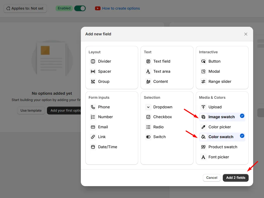
Add the option values you want shoppers to see. Below the option values, WowOptions shows three buttons, including Linked Products.
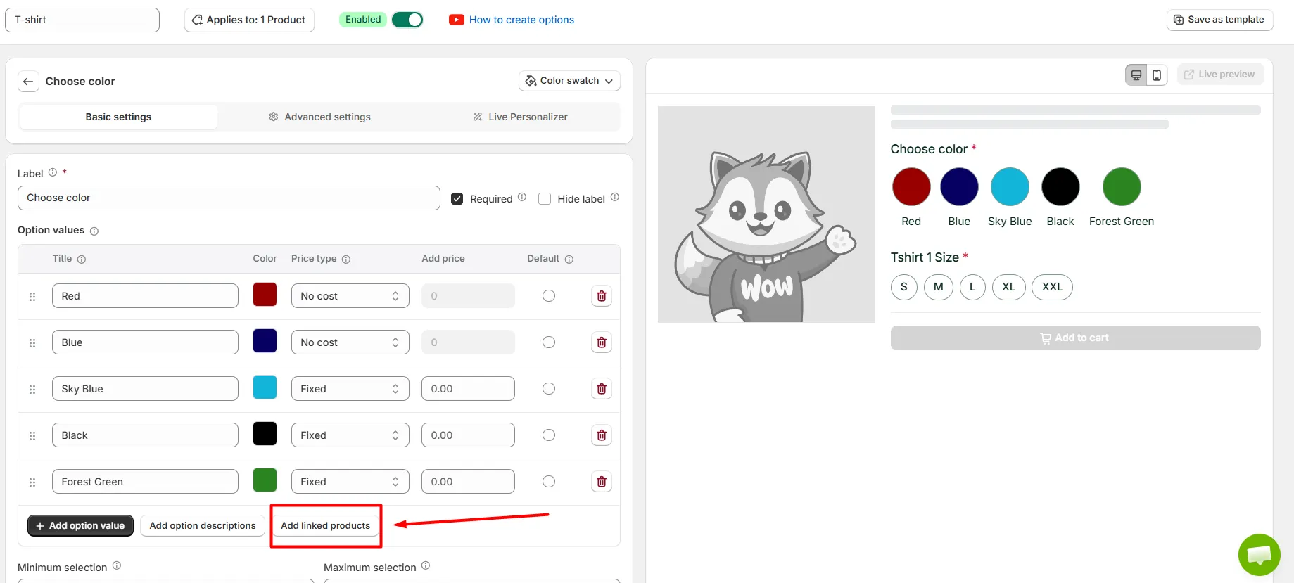
If the shopper must choose before continuing, you can also enable Required in the General tab.
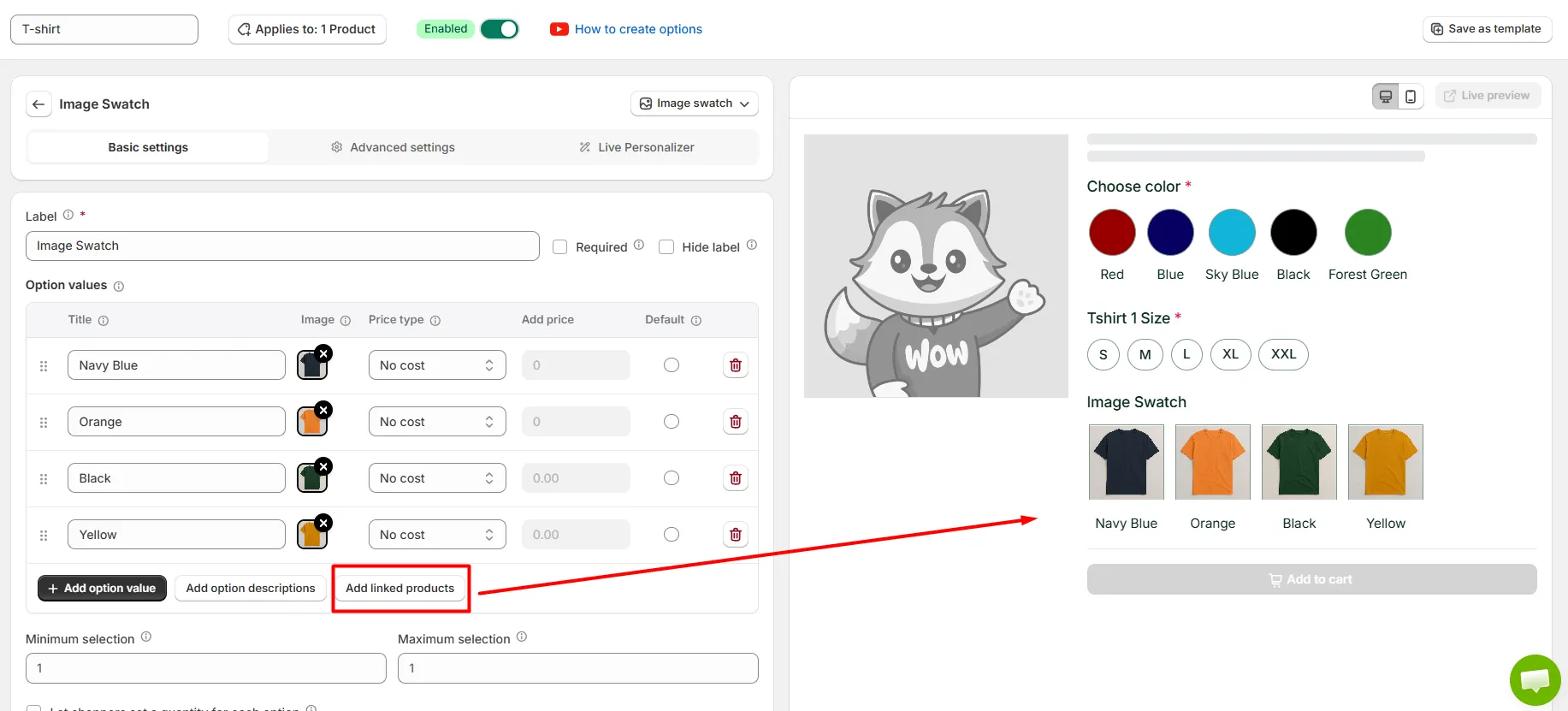
Keep the mapping simple. One visible option value should point to one intended Shopify product. A one-to-one structure makes mistakes easier to spot during testing.
Step 2: Enable Linked Products and Assign Each Destination
Click Linked Products, then turn on Enable Linked Products.
Assign a Shopify product to each individual option value. For example, Black can point to Black Hoodie, Cream to Cream Hoodie, and Navy to Navy Hoodie.
This per-value setup is what lets one swatch group carry several destinations.
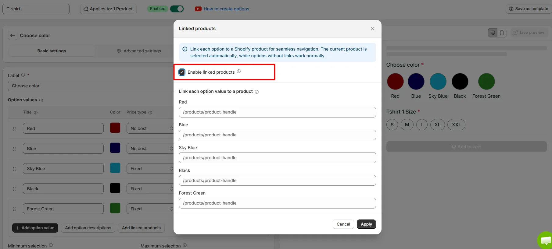
After every value has the correct product, click Apply.
Check the mapping carefully before moving on. A misplaced product link can look correct in the editor but send shoppers to the wrong color or design on the storefront.
Step 3: Apply the Field to the Right Product and Save
Open the Apply dropdown and select the product where the field should appear, then save that assignment.
After that, save the entire option set.
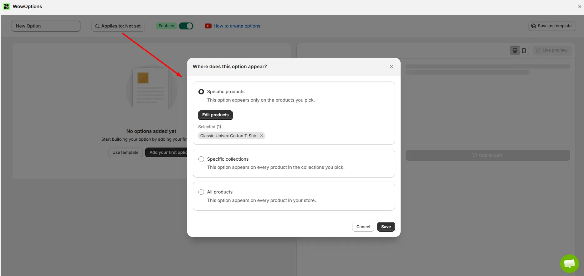
That last save matters. The storefront does not update until the full option set is saved, so a correctly configured field can still appear unchanged if the set itself was not saved.
Repeat the assignment where needed so each related product shows the appropriate swatch group. Then test every destination from the storefront, not only the first product you configured.
What Color and Image Swatches Do
A color swatch is a clickable block of color. An image swatch uses a picture instead, which works better when a shade name cannot communicate a pattern, fabric, finish, or design.
Shopify can render swatches through themes and category metafields. Those native approaches still assume that the values belong to the product variation system Shopify already understands.
That works well when Black, Blue, and Green are variants of one shirt. It does not solve the same problem when Black Shirt, Blue Shirt, and Green Shirt are three separate product pages.
Combined listing tools approach that catalog problem in another way and can make sense for larger catalogs. WowOptions takes a different route by letting supported option values carry product links.
The field still looks like a familiar selector, but the selected value can navigate to another product. That is the behavior needed when colors, designs, or styles live on separate Shopify product pages.
How Cross Product Links Turn Swatches into Product Links
Cross Product Links turn an option value into a navigation link to another Shopify product page. They work with Color Swatch, Image Swatch, Button, and Dropdown fields, so one option set can point shoppers toward several related product destinations.
The link sits on each option value rather than on the field as a whole. That means one swatch group can contain several values, with every value pointing to a different product page.
The WowOptions documentation uses related hoodie products to illustrate the idea, such as Classic Hoodie, Oversized Hoodie, and Premium Fleece Hoodie. Each option can send the shopper to the matching product.
Supported field types include:
- Color Swatch: Use it when each product color is managed as a separate Shopify product.
- Image Swatch: Use it when each design, pattern, or style has its own product page.
- Button: Use it for choices such as different product models or fits.
- Dropdown: Use it when shoppers need to choose among several related product versions.
For this guide, Color Swatch and Image Swatch are the main focus because they create the most visual browsing experience.
How to Configure the Color Swatch Field
The Color Swatch option has three main tabs: General, Style, and Conditions.
Each option value includes Title, Color, Price Type, Price, and Default. Price Type supports Fixed, Percentage, and No Cost.
Those pricing controls can support a premium colorway when the option itself carries a surcharge. For cross-product navigation, use them only when that pricing behavior matches your product setup.
The General tab also includes Per Item Quantity Limit, Allow Multiple, Total Quantity Limit, and Number of Selection Allowed.
For a normal color group that sends shoppers to one related product, single selection is usually the clearer model.
The Style tab supports Color with Title and Only Color, plus field widths of 33%, 50%, 66%, and 100%.
Custom dimensions let you set Width, Height, and Border Radius in pixels. The documentation uses 50px by 50px with an 8px radius as its example.
The Conditions tab can show or hide the field based on selected custom options or Shopify variants.
How to Configure the Image Swatch Field
The Image Swatch option follows the same general structure as Color Swatch. The main difference is simple: each value uses an uploaded Image where Color Swatch uses a color value.
Use Image Swatch when the shopper needs to see the visual difference. Oak versus walnut, striped versus solid fabric, or two printed patterns are easier to judge from images than color names.
Its values include Title, Image, Price Type, Price, and Default.
The quantity control is labeled Enable Quantity Limit, which differs from the Color Swatch label Per Item Quantity Limit.
The Style tab supports Image with Title and Only Image. It also supports the same field widths and custom dimensions.
The documentation uses 80px by 80px with an 8px radius as its image swatch dimension example.
Crop option images consistently so the row does not look uneven. Keep image files reasonably small because oversized thumbnails can slow product pages, especially on mobile connections.
How to Handle Large Swatch Groups (Image and Color Swatch)
A long row of colors or images can dominate the product page, especially on smaller screens.
WowOptions provides Color Swatch Slider and Image Swatch Slider for larger option groups.
Add the swatch field and its values, then open Advanced Settings and enable Show as Slider.
You can set the number of rows, the number of colors or items shown, arrow position, and alignment. Image swatches also include a navigation style choice.
The documented bed sheet example uses the slider to keep a large color range compact while shoppers can still browse every option.
This is useful when a standard row or grid would push important product content too far down the page.
Two Related Features Worth Knowing
Change Product Image on Selection
Change Product Image on Selection changes the first gallery image while the shopper stays on the current page.
Assign an image to an option value, then enable the feature from Advanced Settings. Selecting the value replaces the first gallery image. Clearing the selection restores the original image.
It supports Image Swatch, Dropdown, Checkbox, Switch, and Radio. Color Swatch is not supported.
This behavior is different from Cross Product Links. A cross-linked swatch sends the shopper to another product page, where that destination loads its own product gallery.
Product Swatch Is a Different Feature
The name Product Swatch can sound similar to cross-product navigation, but it solves a different problem.
Product Swatch adds a product to the cart as an additional item. The shopper stays on the current page, and the selected product becomes another order line.
Use Cross Product Links when a swatch should send the shopper to another product page.
Use Product Swatch when you want to sell an extra item, such as a gift box or paired accessory, alongside the current product.
Frequently Asked Questions
Do color swatches on Shopify require variants?
Which WowOptions plan includes Cross Product Links?
Will cross-linked swatches create duplicate content for Google?
Can I use Cross Product Links on collection pages?
Does the shopper lose their selections when they follow a swatch?
Can one swatch group link to products in a different collection?
Wrapping Up
For separate products, the important distinction is whether a swatch selects a value on the current page or sends the shopper to another product. Cross Product Links handle the second behavior.
The setup is straightforward: choose a supported option type, enable Linked Products, assign each option value its destination, apply the field to the right product, then save the complete option set.
Before committing to this structure, confirm that your plan includes Linked Products and decide whether the colors truly need separate product pages. Variants remain simpler when pricing, inventory, and product information are shared.
If you also need regular custom fields, use the custom product options guide. For visual personalization on the current product, continue with the live preview tutorial.