The Button option lets customers trigger an action, such as opening a guide, applying a configuration, or starting a customization step.
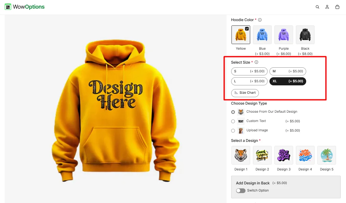
 Here's an example of how the Button appears on the frontend
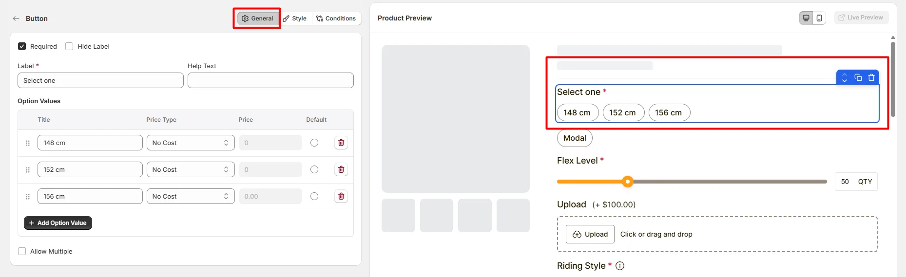
This tab controls the core configuration of the Button option, including the label, help text, selectable button options, pricing behavior, and selection rules.
Enable this option to make the button selection mandatory. Customers must choose at least one option before they can add the product to the cart.
Hide the field label from customers. Enable this when the context of the options is already clear or when you want a minimal layout.
The visible name shown to customers (for example: “Select Size”, “Choose Material”, or “Gift Wrap Options”). Keep the label short and descriptive so customers understand what they need to select.
Short instructional text shown to customers to guide their selection.
Examples:
The display position of the help text can be controlled in the Style Tab.
Defines the selectable button options that customers can choose from.
Each option includes the following settings:
Available price types include:
Use Add Option Value to create additional selectable buttons.
Enable this option to allow customers to select more than one button option. This is useful for selections such as add-ons or extra features.
Limits how many options customers can select.
Example:
This tab controls how the Button options appear on the product page, including help text placement, button layout direction, field width, and custom styling.
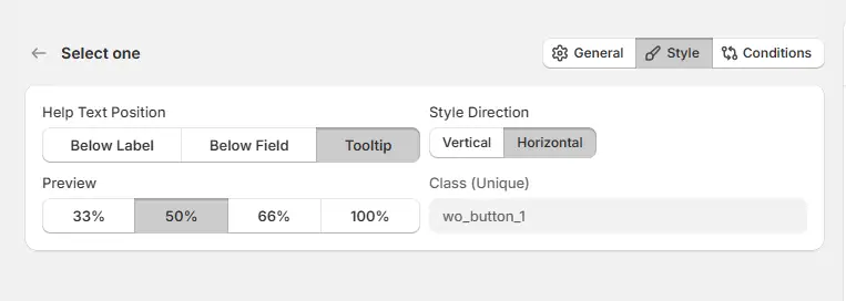
Controls where the help text appears relative to the field.
Controls how the buttons are arranged on the product page.
Controls how wide the button field appears within the options layout.
A unique CSS class assigned to the button field (example: wo_button_1).
Use this if you want to:
Use this tab to control the visibility of the Button option. You can show or hide it only when specific custom options or Shopify variants are selected. To learn how to configure conditional logic, follow this guide.
If you experience any issues while configuring the Button option, reach out to the WowApps support team via the in-app chat or email support@wowapps.io. You can also reach the dedicated manager at nayeem@wowapps.io.
Explore the FAQ to learn about common issues and solutions