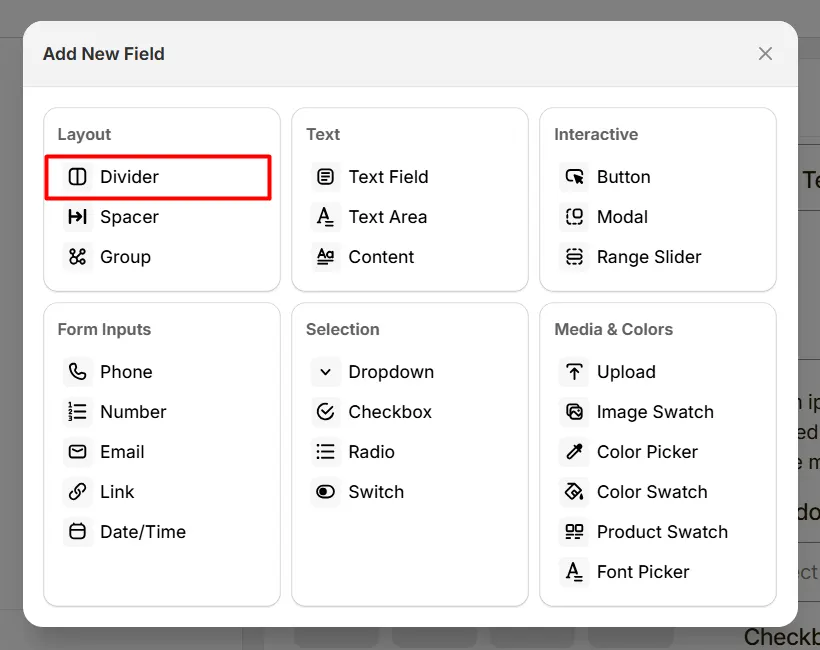
The Divider option lets you add a visual separator between sections to organize product options, such as separating personalization fields from add-ons. Instead of showing all options in one long list, the divider creates a visual break between different option groups.
Here's an example of how the Divider appears on the frontend
This tab controls the basic configuration of the Divider field, including the label and divider height.
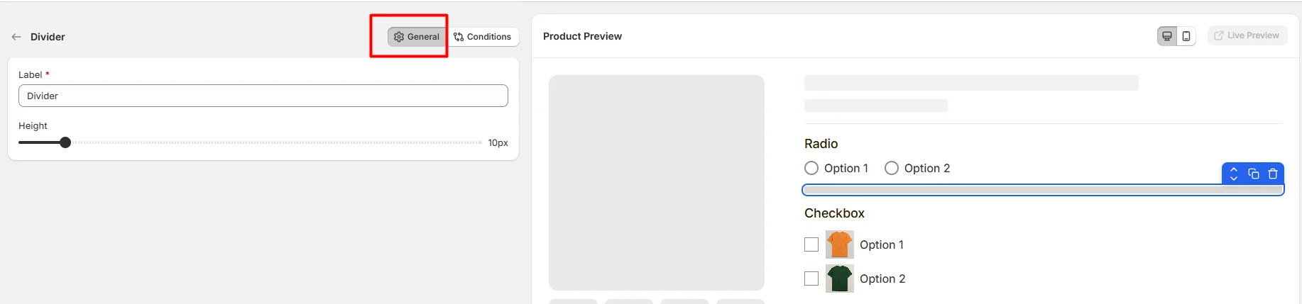
The internal name used to identify the divider in the options editor. This label is not shown to customers on the product page.
Example: Divider
Controls the vertical thickness of the divider line displayed between option fields. Use the slider to adjust how visually prominent the divider appears when separating sections.
Example:
Use dividers when your product personalization form has:
Use this tab to control the visibility of the Divider option. You can show or hide it only when specific custom options or Shopify variants are selected. To learn how to configure conditional logic, follow this guide.
If you experience any issues while configuring the Divider option, reach out to the WowApps support team via the in-app chat or email support@wowapps.io. You can also reach the dedicated manager at nayeem@wowapps.io.
Explore the FAQ to learn about common issues and solutions