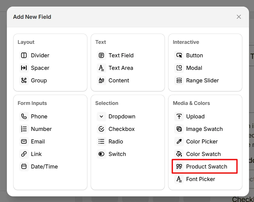
The Product Swatch option lets customers select product variations using visual swatches, such as different product styles or variants.
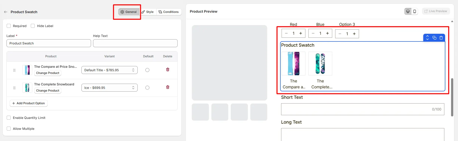
Here's an example of how the Product Swatch appears on the frontend
This tab controls the Product Swatch field configuration, including the label, help text, linked products, selection behavior, and quantity limits.
Enable this option to make selecting a product mandatory. Customers must choose one of the product swatches before they can add the main product to the cart.
Hide the field label from customers. This can be useful when the swatch group is visually clear or when you want a cleaner product page layout.
The visible name shown to customers. Keep the label short and clear so customers understand the purpose of the field. Examples include:
Short instructional text that helps customers understand what to do. For example:
The position of the help text can be controlled from the Style Tab.
Defines which products will appear as selectable swatches. Each row represents one product option and includes the following settings:
Click Add Product Option to create additional product swatches.
Limits the quantity allowed for each selected product option.
Enable this option to allow customers to select multiple product swatches instead of only one.
Limits the total quantity across all selected product swatches.
Controls how many product swatches customers can select.
This tab controls how the Product Swatch field appears on the product page, including display type, layout style, help text position, field width, and custom swatch dimensions.
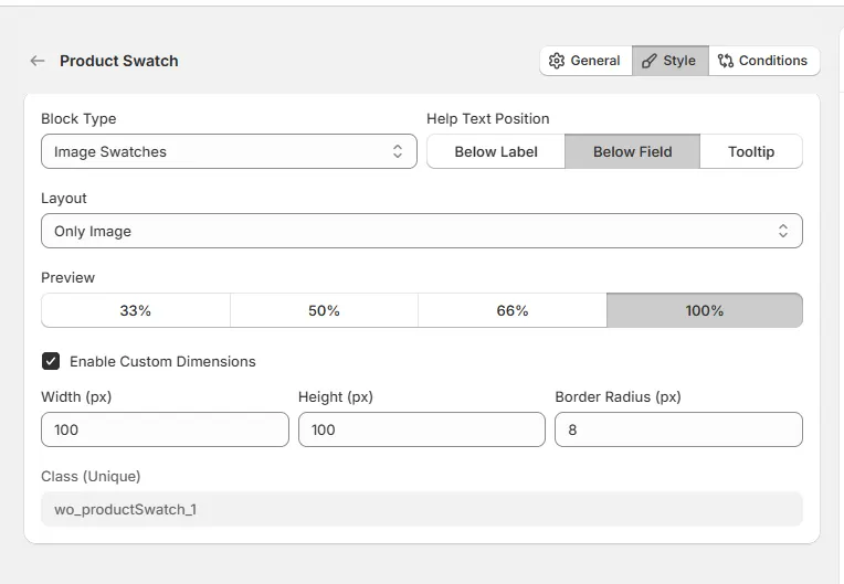
Defines how the linked product options are displayed to customers. Available options include:
Controls where the help text appears relative to the field.
Controls how the product swatch content is displayed.
Controls how wide the field appears relative to the available option area.
Allows you to manually control the size and appearance of the product swatches.
Example settings:
A unique CSS class assigned to this field (example: wo_productSwatch_1). This can be used for custom styling or targeting the field with CSS or scripts.
Use this tab to control the visibility of the Product Swatch option. You can show or hide it only when specific custom options or Shopify variants are selected. To learn how to configure conditional logic, follow this guide.
If you experience any issues while configuring the Product Swatch option, reach out to the WowApps support team via the in-app chat or email support@wowapps.io. You can also reach the dedicated manager at nayeem@wowapps.io.
Explore the FAQ to learn about common issues and solutions