The Radio option lets customers choose one option from several visible choices, such as color, package type, or configuration.
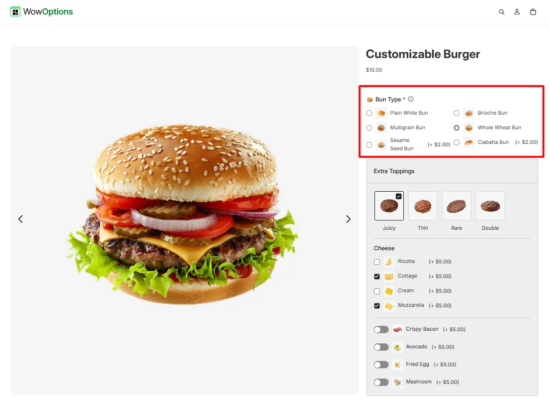
Here's an example of how the Radio Button appears on the frontend
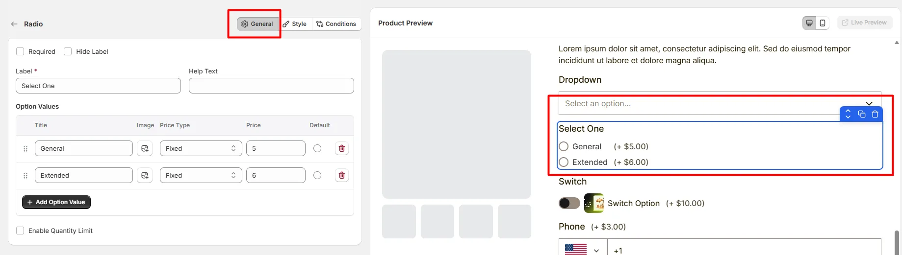
This tab controls the core configuration of the Radio field, including the label, help text, selectable options, pricing behavior, and quantity limits.
Enable this option to make the radio selection mandatory. Customers must choose one option before they can add the product to the cart.
Hide the field label from customers. Enable this when the purpose of the radio group is already clear or when you want a minimal layout.
The visible name shown to customers (for example: “Select Plan”, “Choose Size”, or “Pick a Package”). Keep the label short and descriptive so customers understand what they need to select.
Short instructional text shown to customers to guide their selection. For examples:
The display position of the help text can be controlled in the Style Tab.
Defines the list of selectable radio options. Each option includes the following settings:
Available price types include:
Use Add Option Value to create additional radio options.
Allows you to limit the quantity associated with each radio option.
This tab controls how the Radio field appears on the product page, including help text placement, layout columns, option image style, field width, and custom styling.
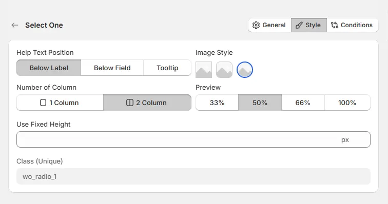
Controls where the help text appears relative to the field.
Controls how the radio options are arranged.
Controls how wide the radio field appears within the options layout.
Controls how option images appear next to the radio options.
Defines a fixed height for the radio option container. This helps maintain consistent layout when options contain images or long labels.
A unique CSS class assigned to the radio field (example: wo_radio_1).
Use this if you want to:
Use this tab to control the visibility of the Radio option. You can show or hide it only when specific custom options or Shopify variants are selected. To learn how to configure conditional logic, follow this guide.
If you experience any issues while configuring the Radio option, reach out to the WowApps support team via the in-app chat or email support@wowapps.io. You can also reach the dedicated manager at nayeem@wowapps.io.
Explore the FAQ to learn about common issues and solutions