The Modal option lets you display additional content in a popup window, such as instructions, size charts, or personalization previews.
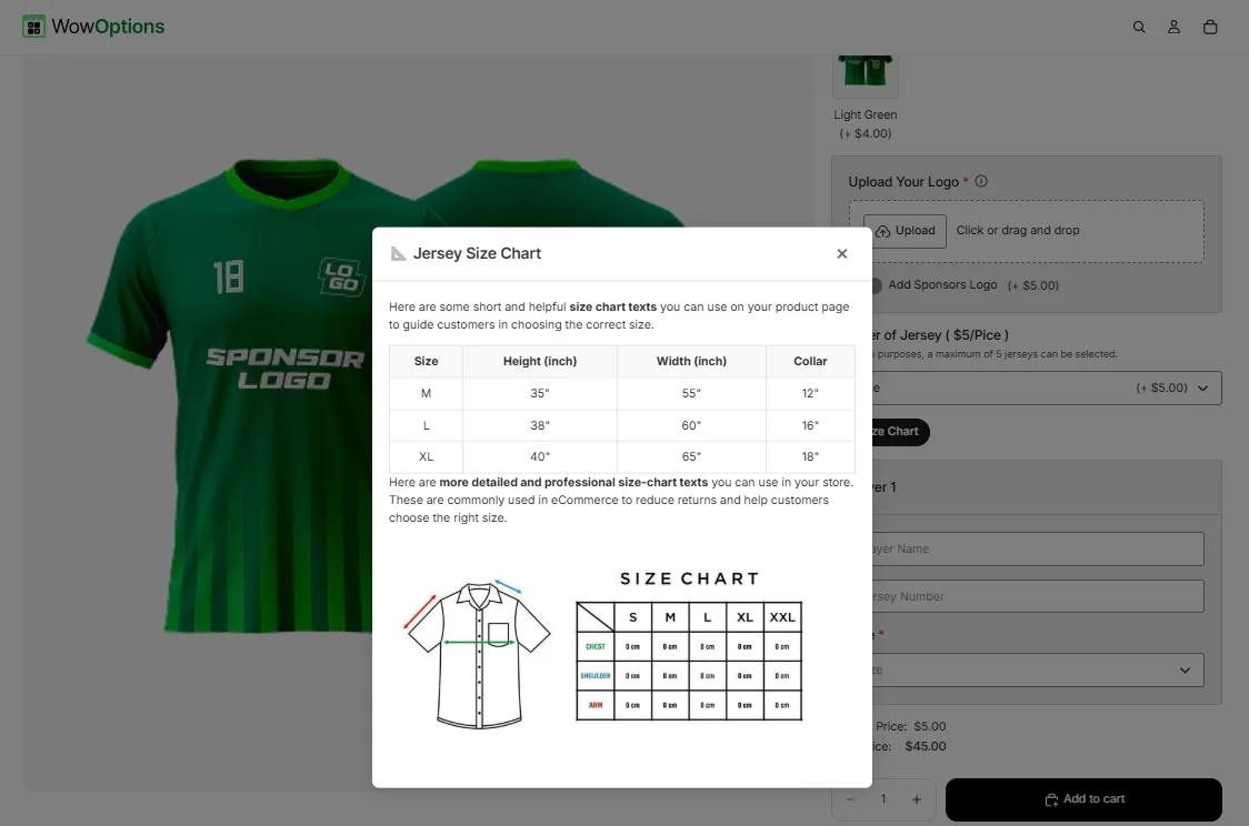
Here's an example of how the Modal appears on the frontend
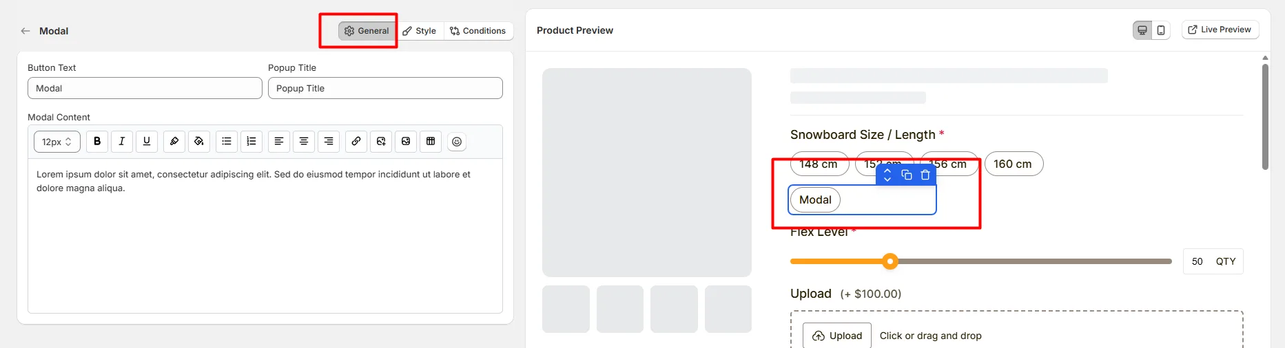
This tab controls the main configuration of the Modal option, including the trigger text, popup title, and the content displayed inside the modal window.
Defines the text displayed on the button or link that opens the modal popup. Choose a short and clear label so customers understand what content the popup will display.
Example:
Defines the title shown at the top of the modal popup. This helps customers quickly understand the purpose of the popup content.
Example:
Defines the content displayed inside the modal window. Use the editor toolbar to format the content. Available formatting options include:
This option is useful for displaying information such as:
This tab controls how the modal trigger and popup appear on the product page, including help text placement, modal width, display type, layout width, and custom styling.
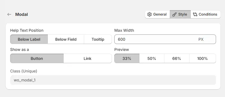
Controls where the help text appears relative to the modal trigger.
Controls how the modal trigger appears on the product page.
Defines the maximum width of the modal popup window.
Example:
Controls how wide the modal trigger appears within the options layout.
A unique CSS class assigned to the modal field (example: wo_modal_1).
Use this if you want to:
Use this tab to control the visibility of the Modal option. You can show or hide it only when specific custom options or Shopify variants are selected. To learn how to configure conditional logic, follow this guide.
If you experience any issues while configuring the Modal option, reach out to the WowApps support team via the in-app chat or email support@wowapps.io. You can also reach the dedicated manager at nayeem@wowapps.io.
Explore the FAQ to learn about common issues and solutions