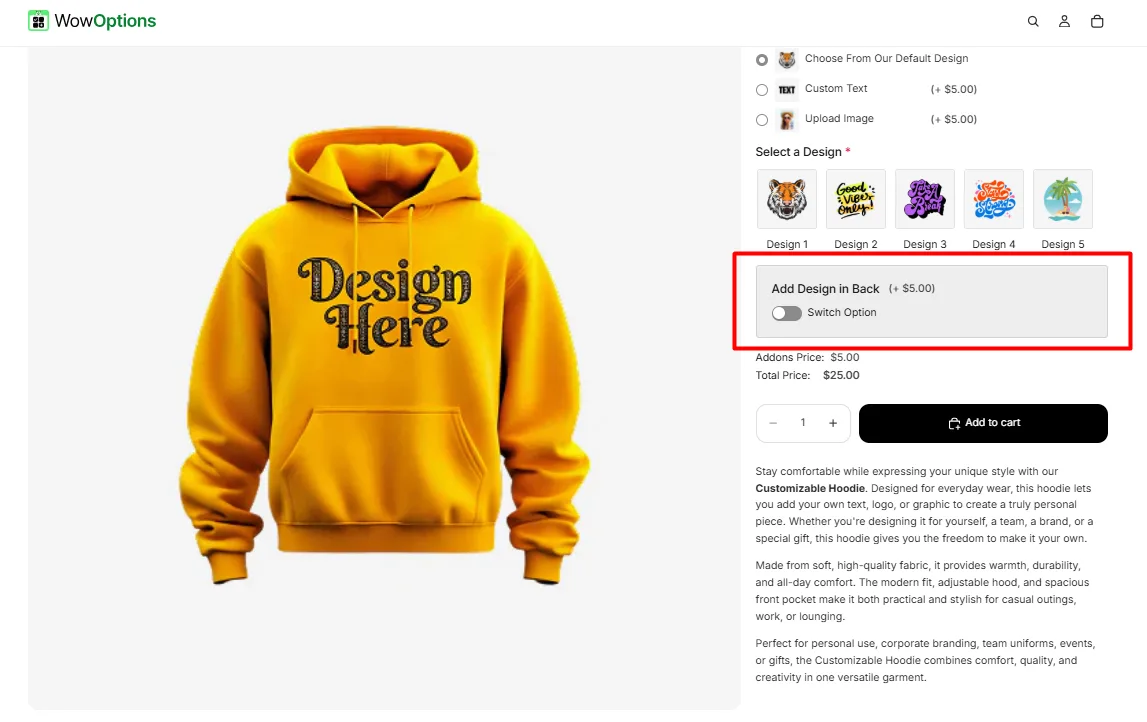
The Switch option lets customers toggle a feature on or off, such as enabling gift wrapping or adding express delivery.
Here's an example of how the Switch appears on the frontend
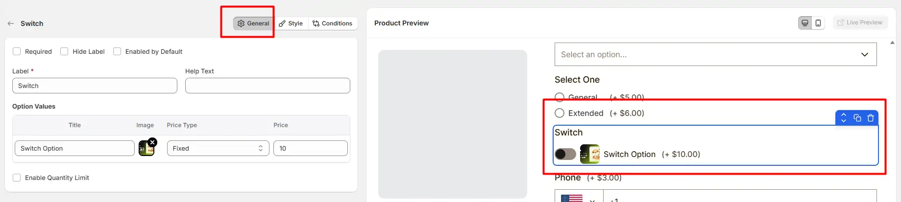
This tab controls the main configuration of the Switch field, including the label, help text, toggle behavior, pricing, and quantity limits.
Enable this option to make the switch mandatory. Customers must enable the switch before they can add the product to the cart.
Hide the field label from customers. This is useful when the purpose of the switch is already clear from the layout or surrounding content.
When enabled, the switch will be turned on automatically when the product page loads. Customers can still toggle it off if they do not want the option.
The visible name shown to customers (for example: “Add Gift Wrap”, “Enable Premium Feature”, or “Include Installation”). Keep the label short and descriptive so customers clearly understand the option.
Short instructional text displayed to guide customers. For examples:
The position of this help text can be controlled from the Style Tab.
Defines the configuration of the switch option.
Available price types include:
Allows you to restrict the quantity when the switch option is enabled.
This tab controls how the Switch field appears on the product page, including help text placement, price position, option image style, field width, and custom styling.
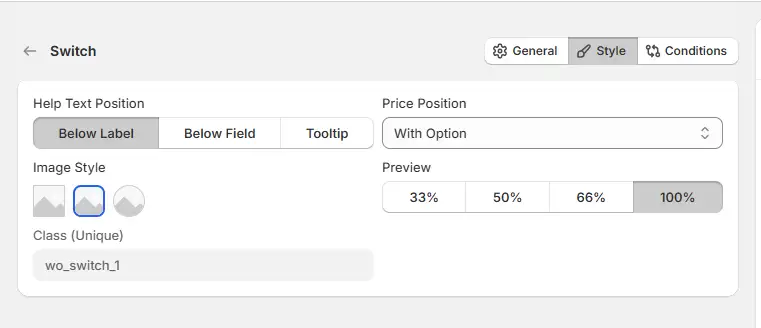
Controls where the help text appears relative to the field.
Controls where the additional price appears when the switch is enabled.
Controls how wide the switch field appears in the options layout.
Controls how the option image appears with the switch.
A unique CSS class assigned to this switch field (example: wo_switch_1). Use this class when you want to apply custom CSS styling or target the switch field with custom scripts.
Use this tab to control the visibility of the Switch option. You can show or hide it only when specific custom options or Shopify variants are selected. To learn how to configure conditional logic, follow this guide.
If you experience any issues while configuring the Switch option, reach out to the WowApps support team via the in-app chat or email support@wowapps.io. You can also reach the dedicated manager at nayeem@wowapps.io.
Explore the FAQ to learn about common issues and solutions