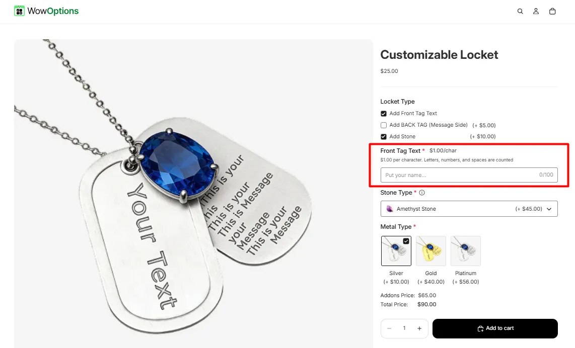
The Text Field option lets customers enter a short piece of text, such as a name, initials, or custom message for printing or engraving.
Here's an example of how the Text Field appears on the frontend
This tab controls the core configuration of the Text Field, including the label, help text, pricing behavior, placeholder text, and character limits.
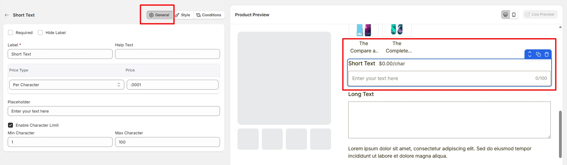
Enable this option to make the field mandatory. Customers must enter text before they can add the product to the cart.
Hide the field label from customers. Enable this when the field context is already clear or when you want a minimal layout.
The visible name shown to customers (for example: “Name”, “Initials”, or “Short Engraving”). Keep the label short and descriptive so customers understand what information is expected.
Short instructional text shown to customers to guide their input.
Examples:
The display position of the help text can be controlled in the Style Tab.
Defines how this field affects the product price.
The amount added to the product price based on the selected Price Type.
For example:
Example text displayed inside the input box before the customer types. Use placeholders to guide the customer on what to enter.
Example: Enter your text here
Enable this option to restrict how many characters customers can enter.
This tab controls how the Text Field appears on the product page, including help text placement, price display position, text formatting behavior, field width, and custom styling.
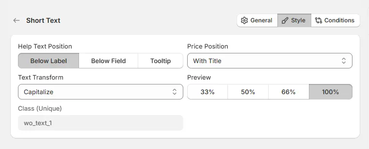
Controls where the help text appears relative to the field.
Controls where the price adjustment label appears.
Automatically changes the format of the customer’s text input.
Controls how wide the field appears within the options layout.
A unique CSS class assigned to the field (example: wo_text_1).
Use this if you want to:
Use this tab to control the visibility of the Text Field option. You can show or hide it only when specific custom options or Shopify variants are selected. To learn how to configure conditional logic, follow this guide.
If you experience any issues while configuring the Text Field option, reach out to the WowApps support team via the in-app chat or email support@wowapps.io. You can also reach the dedicated manager at nayeem@wowapps.io.
Explore the FAQ to learn about common issues and solutions