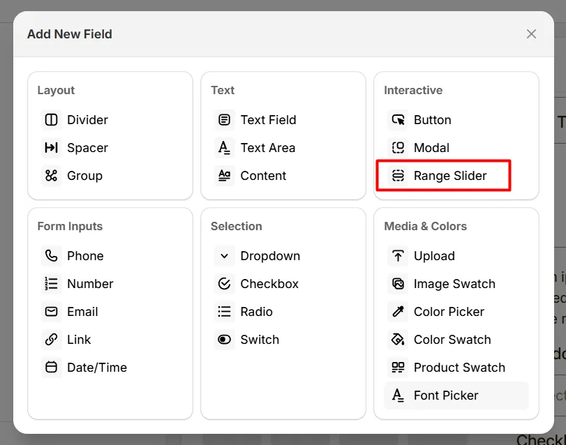
The Range Slider option lets customers select a value within a range by sliding a control, such as choosing a quantity, size range, or measurement.
Here's an example of how the Range Slider appears on the frontend
This tab controls the core configuration of the Range Slider option, including the label, help text, pricing behavior, slider range, step value, and default value.
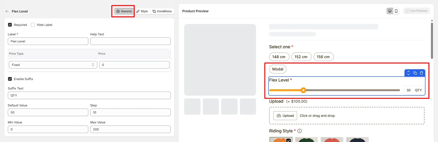
Enable this option to make the slider selection mandatory. Customers must choose a value before they can add the product to the cart.
Hide the field label from customers. Enable this when the slider purpose is already clear or when you want a minimal layout.
The visible name shown to customers (for example: “Quantity”, “Length”, or “Customization Level”). Keep the label short and descriptive so customers understand what the slider controls.
Short instructional text shown to customers to guide their selection. The display position of the help text can be controlled in the Style Tab.
Examples:
Defines how the selected slider value affects the product price.
The amount added to the product price based on the selected Price Type. For example:
Enable this option to display additional text next to the selected slider value. This helps clarify the meaning of the value displayed to customers.
In the Suffix Text field, defines the text displayed after the selected value. For example:
Sets the value that the slider starts with when the product page loads.
Defines the increment amount when the slider moves. For example:
Sets the minimum value that customers can select.
Sets the maximum value that customers can select.
This tab controls how the Range Slider appears on the product page, including help text placement, field width, and custom styling.
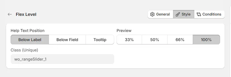
Controls where the help text appears relative to the field.
Controls how wide the slider field appears within the options layout.
A unique CSS class assigned to the slider field (example: wo_rangeSlider_1).
Use this if you want to:
Use this tab to control the visibility of the Range Slider option. You can show or hide it only when specific custom options or Shopify variants are selected. To learn how to configure conditional logic, follow this guide.
If you experience any issues while configuring the Range Slider option, reach out to the WowApps support team via the in-app chat or email support@wowapps.io. You can also reach the dedicated manager at nayeem@wowapps.io.
Explore the FAQ to learn about common issues and solutions