The Date and Time option lets customers select a specific date or time, such as a delivery date, appointment time, or event date.

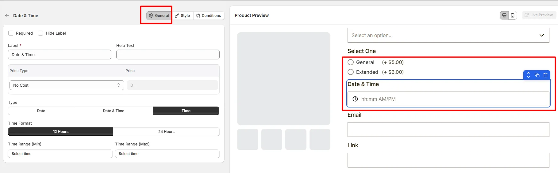
Here's an example of how the Date & Time Field appears on the frontend
This tab controls the core configuration of the Date & Time field, including the label, help text, pricing behavior, date or time selection type, and available date or time restrictions.
Enable this option to make the date or time selection mandatory. Customers must select a valid date or time before they can add the product to the cart.
Hide the field label from customers. Enable this when the purpose of the field is already clear or when you want a minimal layout.
The visible name shown to customers (for example: “Delivery Date”, “Appointment Time”, or “Booking Schedule”). Keep the label short and descriptive so customers understand what they need to select.
Short instructional text shown to customers to guide their selection. For examples:
The display position of the help text can be controlled in the Style Tab.
Defines how the selected date or time affects the product price.
The amount added to the product price based on the selected Price Type. For example:
Defines what customers can select.
Use the appropriate option depending on whether the product requires a specific day, a time slot, or both.
Controls how the selected date is displayed. Choose a format that matches your store's regional date format from a list of pre-defined format.
Defines the earliest and the latest date customers are allowed to select.
Example: Limit bookings within a specific future time range.
Enable this option to prevent customers from selecting the current day.
This is useful when same-day bookings or deliveries are not allowed.
Allows you to block specific calendar dates from being selected. For example:
Allows you to disable certain days of the week. For example: Disable Saturday and Sunday for business-day deliveries.
Allows you to disable specific days of each month. Example: Disable the 1st and 15th of every month.
Controls how the time selector is displayed.
Defines the earliest and the latest time customers can select. This allows you to restrict selections to your available working hours.
This tab controls how the Date & Time field appears on the product page, including help text placement, price display position, field width, and custom styling.

Controls where the help text appears relative to the field.
Controls where the price adjustment label appears.
Controls how wide the date and time field appears within the options layout.
A unique CSS class assigned to the date and time field (example: wo_datetime_1). Use this if you want to:
Use this tab to control the visibility of the Date/Time option. You can show or hide it only when specific custom options or Shopify variants are selected. To learn how to configure conditional logic, follow this guide.
If you experience any issues while configuring the Date/Time option, reach out to the WowApps support team via the in-app chat or email support@wowapps.io. You can also reach the dedicated manager at nayeem@wowapps.io.
Explore the FAQ to learn about common issues and solutions